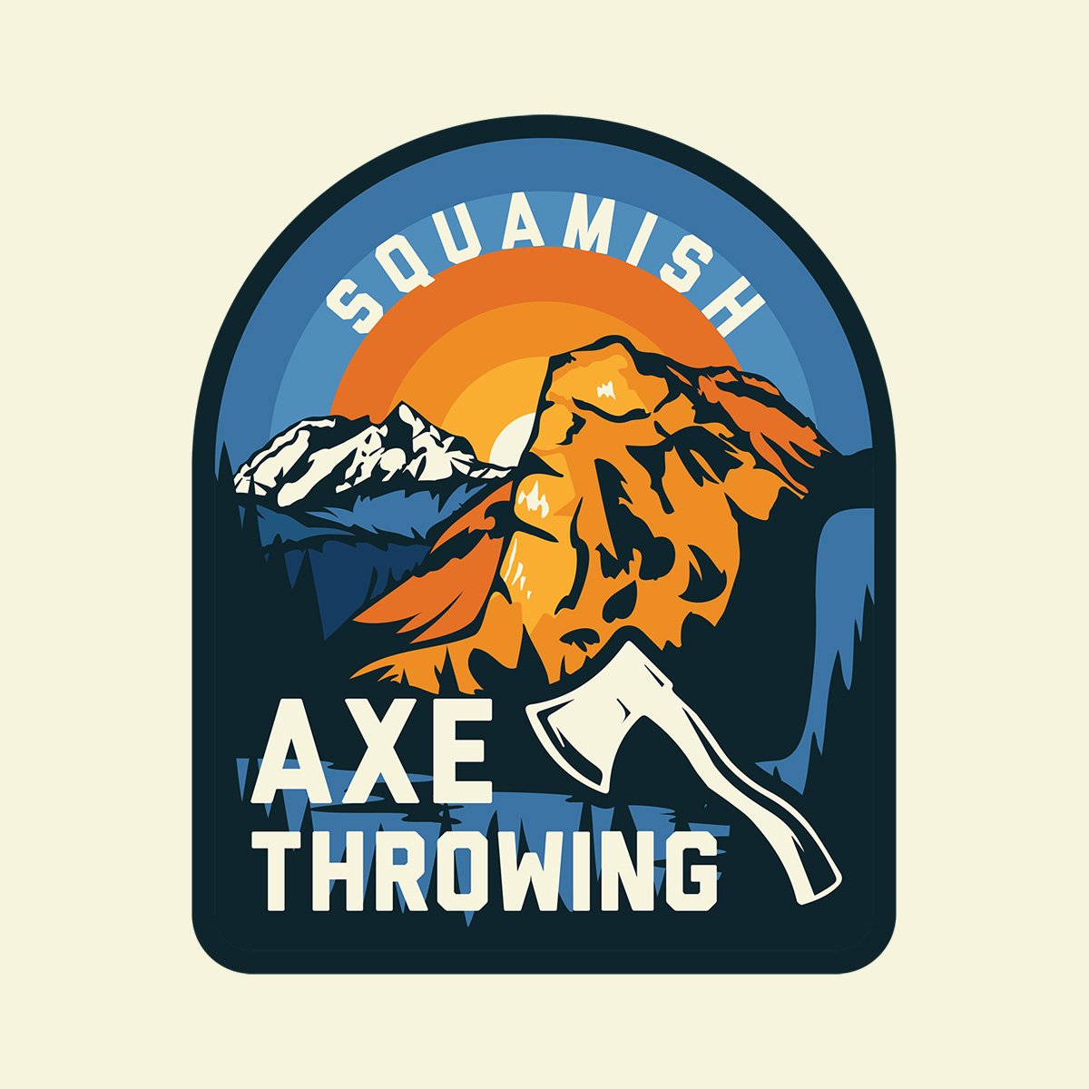
When Rope Runner Park added their latest attraction, Squamish Axe Throwing, a unique brand was required to set this activity apart from their main attraction, the Rope Runner Aerial Adventure Park.
With Squamish’s history of being a famous logging town, I wanted to include the beauty of all that is Squamish within the illustration of the logo. The illustration includes, both The Chief and Mount Garibaldi with the iconic Shannon Falls streaming into Howe Sound.
Rope Runner’s brand being green and black, I selected a bright orange and blue palette to make this side attraction have a life of it’s own with the featured attraction towering behind it.
I am really resonating with arches right now so the primary logo is contained within an arch. It looks fantastic on the back of t-shirts, stickers and fronts of brochures. However, arches don’t always work in all materials so a secondary circular badge was created to use on social media and top of the website.
Black and white variations were created and turns out that a sunset in black and white becomes a bulls-eye!
A brochure was designed and a page on the roperunnerpark.com website was created.